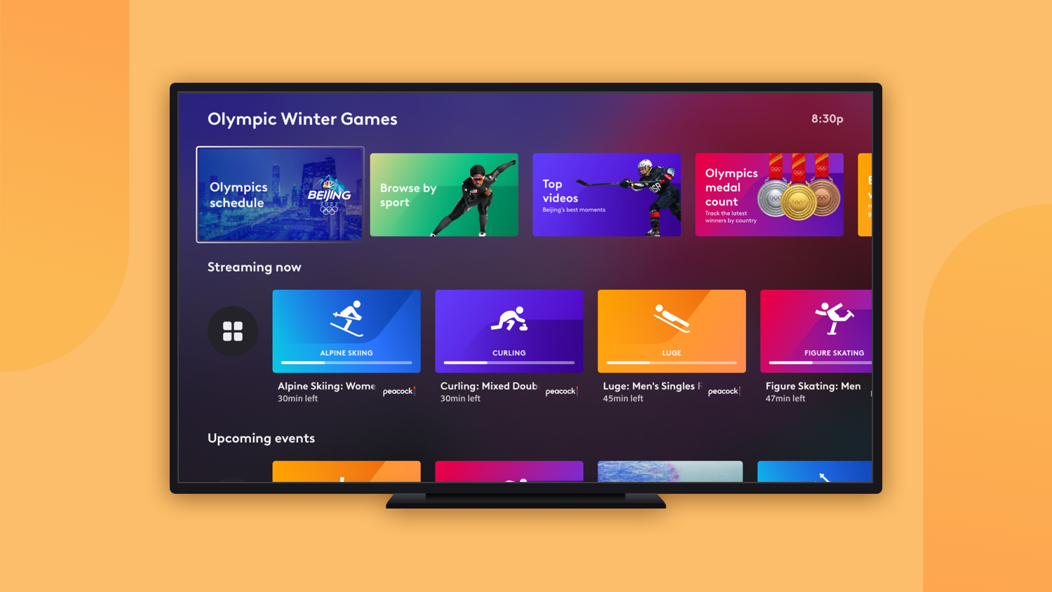
Goal
Design the brand and visual identity for the Summer and Winter Olympics, and build an asset library in Sketch and Abstract to be used in the production of thousands of editorial tiles across Xfinity cable and streaming platforms (X1, Flex, and Stream).
Role
I was the lead visual designer on this project. After landing on the final identity through rounds of feedback and iterations, I worked alongside other visual designers and the sports product team to produce all of the Olympics tiles seen across the Xfinity TV and mobile products.
Palette & Typography
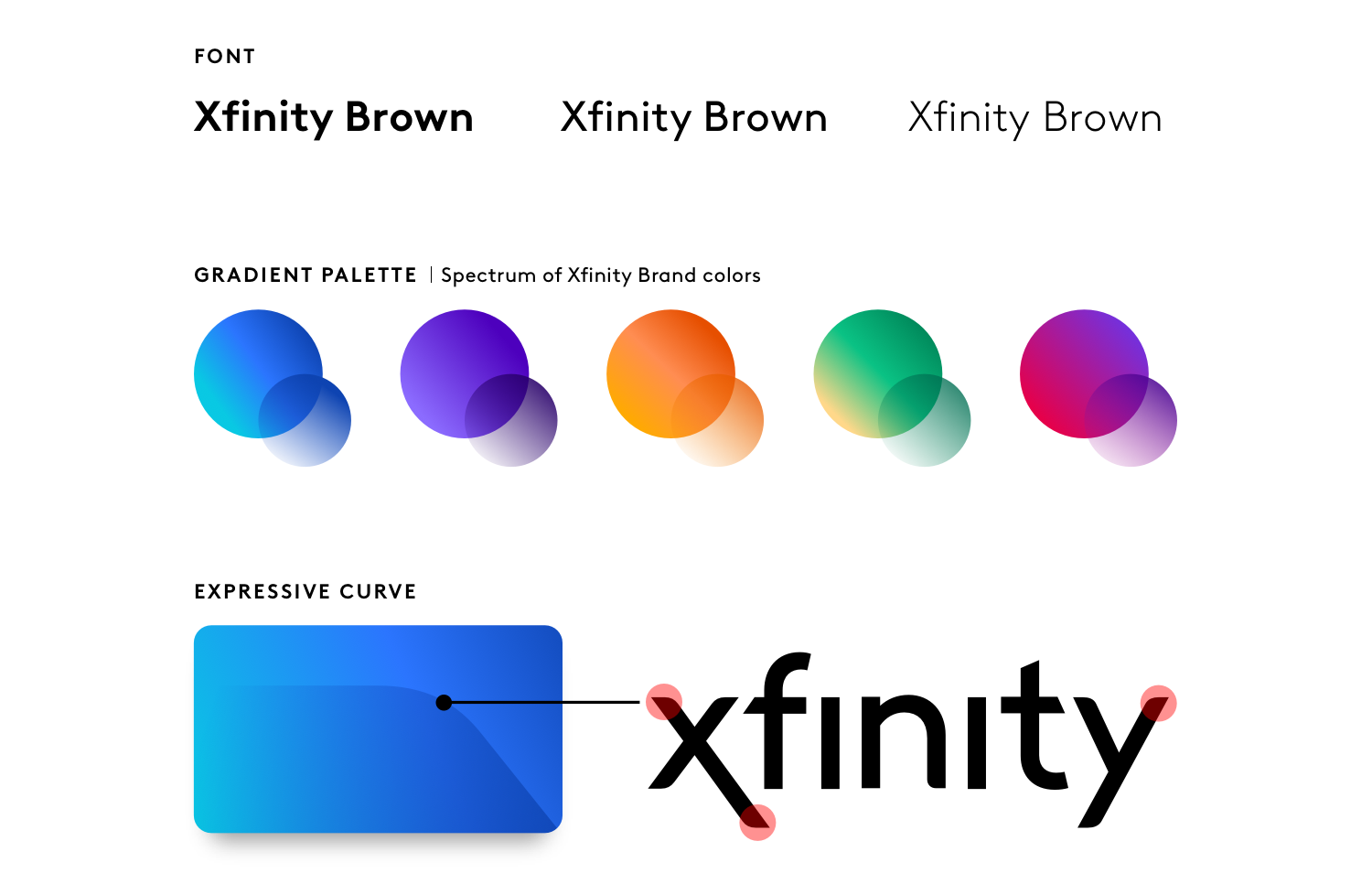
The gradient color palette used in the tiles is a blend of colors from Xfinity’s brand palette. The tiles feature an expressive curve for added visual texture that stems from the ascender and descender curves of the Xfinity logo. The typeface used is “Xfinity Brown”, our brand font.
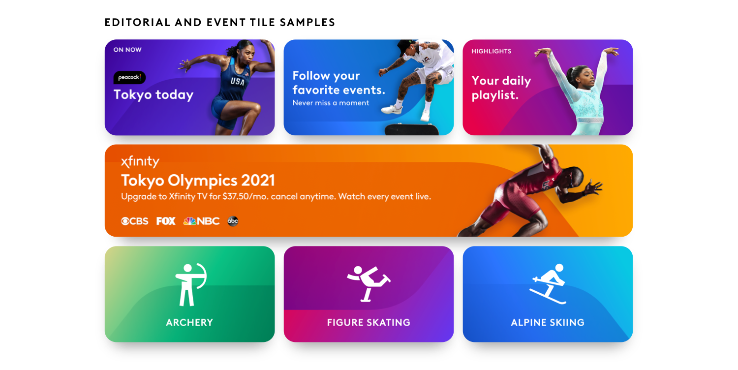
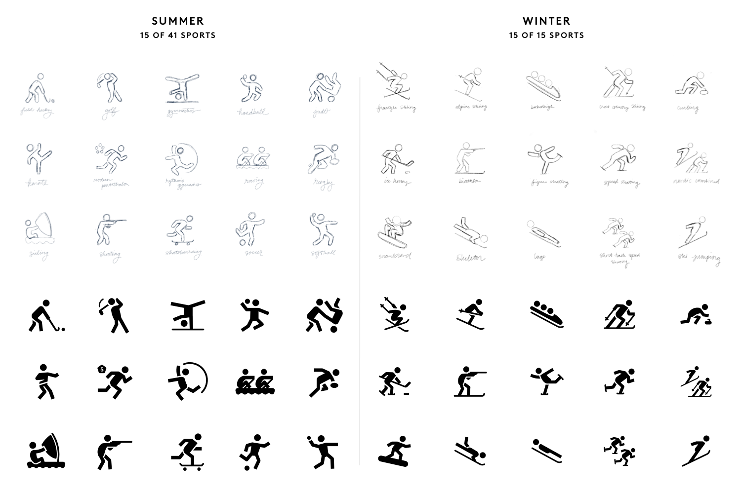
Pictograms
Our XD (experience design) team never had Olympics pictograms of their own before, so I was tasked to illustrate a set for both the Summer and Winter Olympics. I sketched all of the pictograms by hand first, before drawing and finalizing them as vectors in Adobe Illustrator. The final set includes all 56 Olympic sports.